Let’s talk about content-free email newsletters
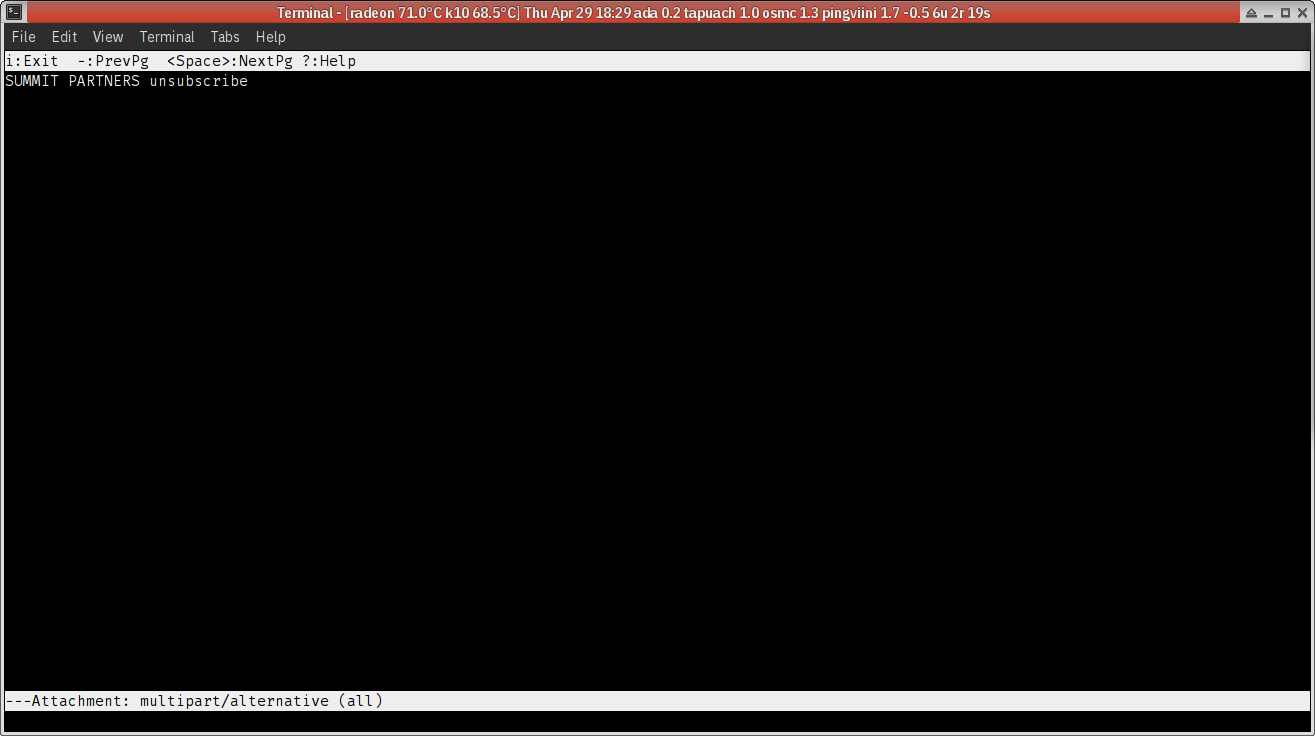
Let’s start with a piece of email I received this morning from a trade show, about “This is what we have lined up for you today”. So what’s lined up for me today?

Nothing, apparently. Yup, that’s the plain text version of the email, in its entirety. Three words. Nothing of relevance. I kid you not.
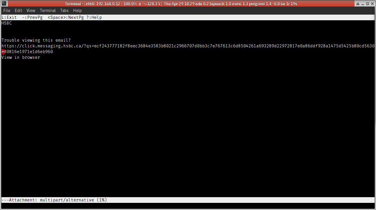
Surely a bank should do better? Ok, let’s look at what I got from a bank three hours ago. Here’s what they have to say about “Last chance to make your move. Get up to $1,100* in bonuses”:

Nothing really, apparently. Do they really think people would even bother with that spammy-looking link? By the way, I haven’t tried reading this in a screen reader but a long web address with 128 random digits isn’t acceptible at all if they cared even a little bit about accessibility.
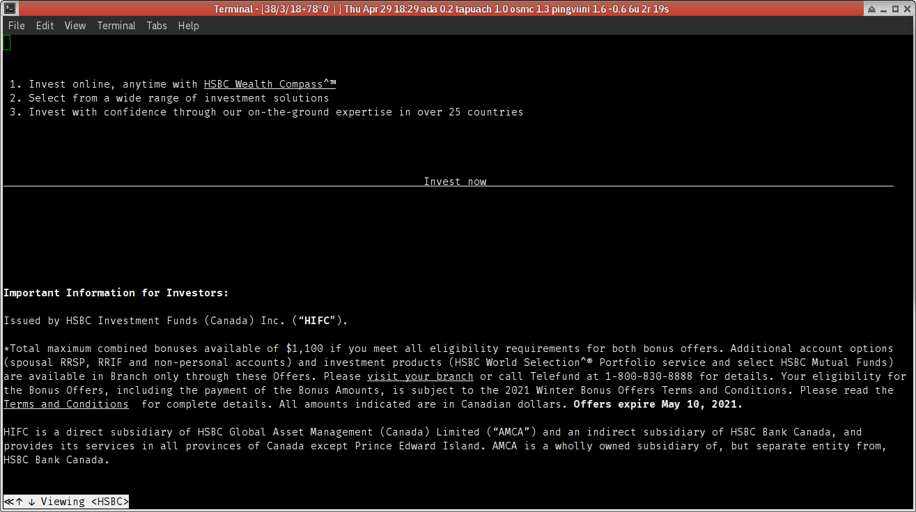
Okay, let’s render that text/html part and see what they really have to say:

Much nicer. So the question is, why don’t they render their content in their plain text version of the mail?
Guys, if you think plain text parts are a waste of space, then don’t even include them. Is that too hard? Dummy content is disrespectful. You’d literally be doing the right thing by doing less work.
