
Lato revisited: We should start treating digits as if they had case
Bringhurst mentions the term “lowercase figures”.[Note 1] That makes it legit for me. Some experienced designers (a lot more experienced than me!) still don’t buy it; they see it as ignorant.[Note 2]
I still like the term. For one, it conveniently explains why we often spell out numbers that begins a sentence[Note 3]: If “oldstyle figures” were the norm and they are “lowercase”, then of course figures should not begin a sentence.
I now think there’s a second reason we should treat the term “lowercase figures” seriously. And again, it has to do with Lato.
I started experimenting with indexing two years ago when I couldn’t look up anything in Chika Miyata’s How to Draw Almost Any Animal. But I didn’t really start experimenting until January this year, when I tried indexing a few books I have, this blog, my collection of Emigre, then now some YouTube videos. It’s when I got to indexing the YouTube videos that I suddenly noticed that heads that begin with oldstyle figures didn’t look like heads.
After pondering the question for a while, I wrote this CSS rule:
h1:first-letter,
h2:first-letter,
h3:first-letter,
dt:first-letter,
li:first-letter,
li > *:first-child:first-letter,
li > *:first-child > *:first-letter {
        /* This will look odd if the first word is a two-digit or longer number, but there's no first-word */
        font-feature-settings: "calt", "kern", "liga", "lnum", "pnum";
}
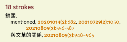
After adding this rule, I reloaded my (still very incomplete) index and saw this:
It didn’t look right.
I thought it didn’t look right just because we’re not used to seeing numbers set with a mix of lining and oldstyle figures.
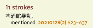
But I scrolled down and saw this:
This didn’t look right either. But since the oldstyle form of 8 has an ascender, seeing this suggests why the 18 doesn’t look right.
First, let’s remember why I liked the term “lowercase figures”.
If oldstyle figures are lowercase, then lining figures are uppercase. Subconsciously, we expect oldstyle and lining figures to act like lowercase and uppercase letters: we expect the uppercase to be as tall as or slightly shorter than the lowercase. Yet in our case of an uppercase 1 followed by a lowercase 8, the uppercase is taller than the lowercase.
There’s so much cognitive dissonance here it’s probably not an exaggeration to say this is wrong, especially in a face like Lato where ascenders in lowercase letters are taller than cap height.
The stroke widths also don’t look consistent.
I believe lining figures are usually designed to harmonize with uppercase letters. But it looks like we don’t seem to think oldstyle figures need to harmonize with anything.
The problem 18 suggests that within the same typeface,
oldstyle figures should harmonize with lining figures
in the same way lowercase letters harmonize with uppercase letters. Notes